So you’ve decided to make a cinematic in Unity but haven’t a clue where to start. Wonder no more, Cinemachine (learn more here) to the rescue! As the premiere package for composing shots in Unity for cinematic and gameplay cameras allowing you to make dynamic and engaging cutscenes. Add Cinemachine to your project to follow below on composing a simple scene.
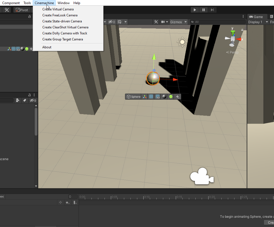
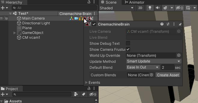
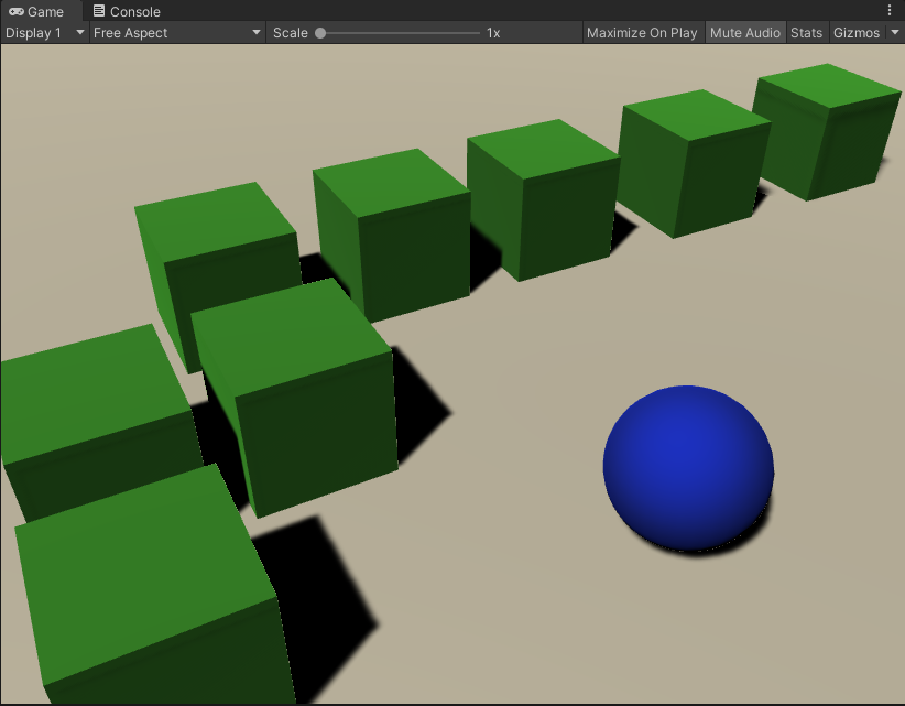
First things first, add a Virtual Camera to your scene. This will add a virtual camera named “CM vcam1” to your hierarchy, this should also add a Cinemachine Brain component to your Main Camera in the scene. This is literally the brains of your Cinemachine system and controls the virtual cameras that we will be adding and using.
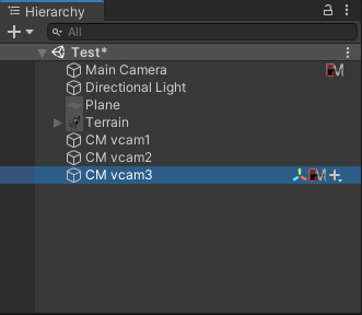
Next we’ll add a few more cameras around the scene. You can quickly achieve the desired point of views by using Crtl+Shift+F to align the vcam’s POV.
You can switch between the POV of the camera by clicking the Solo button on the Cinemachine component, this allows the virtual camera to take control of the Main Camera. This is where pre-visualization elements will help guide you how to properly place your camera shots to align with the intent of the scene.
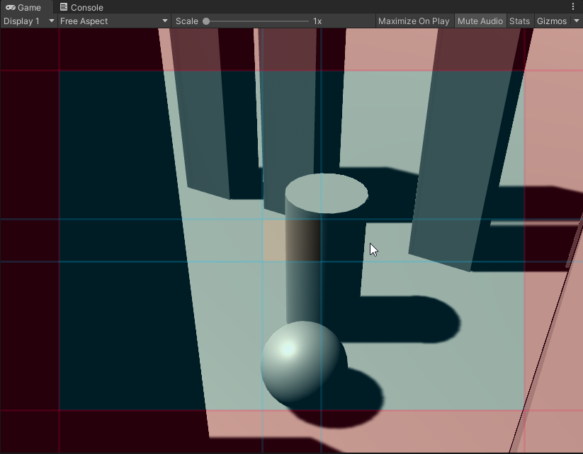
As illustrated above, in your vcam’s Aim settings you can control the soft/hard zones (the blue/red boxes) which should be the focus of your shots as well as the dead zone (the empty center portion) which as long as the subject remains in that box, the camera should not move.
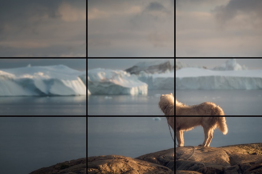
When putting together your scenes and orienting your shots it’s a good idea to refer to the Rule of Thirds. This a common guidelines for aligning subjects in a frame by breaking up the image into quadrants of 3 by 3 blocks like above. By placing the subjects along those guiding lines at intersections such as the dog illustrated above. The idea is that you can make more aesthetically pleasing shots by guiding the viewer’s eye. However it’s worth mentioning like all creative endeavors that if a shot looks better to your eye breaking this rule, just go ahead and break it.
There are other methods for composing shots that fall outside the scope of this article but completely worth your attention. I’ll briefly go over them and let you delve further.
Fill The Frame: Your subjects should be front and center, make it hard for the viewer to miss them by having them the main attraction of the frame.
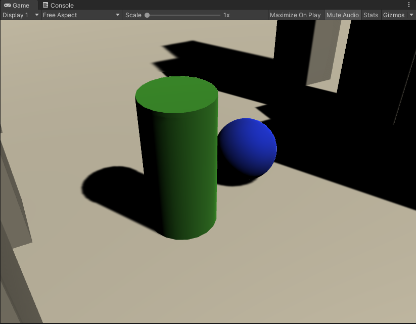
Color: Utilizing colors is one of the best elements to make your scenes pop. Make your subjects stand out against the backdrop.
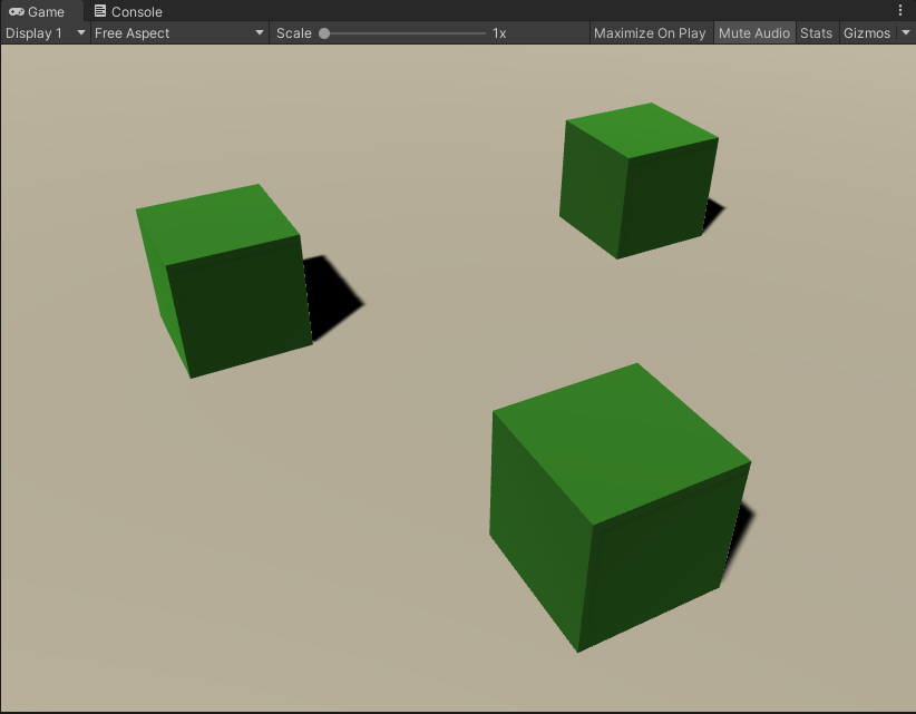
Depth: Adding elements to the foreground and background creates a level of depth that otherwise wouldn’t present. This can be useful for creating a sense of scale or dynamism.
Leading Lines: It’s natural to follow patterns when looking at an image or video you can use that to your advantage to draw attention to the subject of the frame.
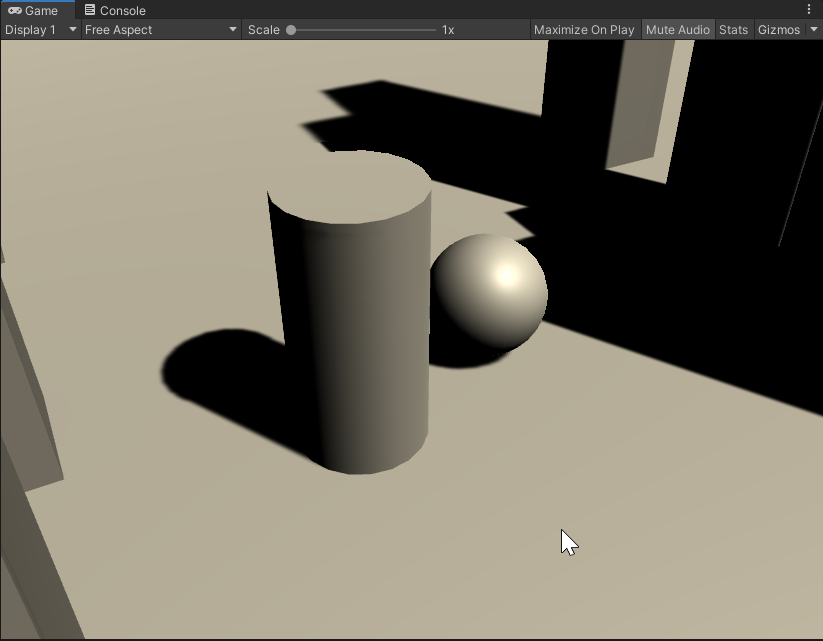
These techniques are but a taste of the kinds of guidelines and methods (more can be found here) you can employ when crafting your scenes in Unity. Given the ubiquity of these techniques it can be useful to look to other forms of media like photographs or films to get a better idea of how to compose your shots as well. Don’t be afraid to draw inspiration from other art forms if they better inform or help you convey your vision. Until next time, happy coding.

